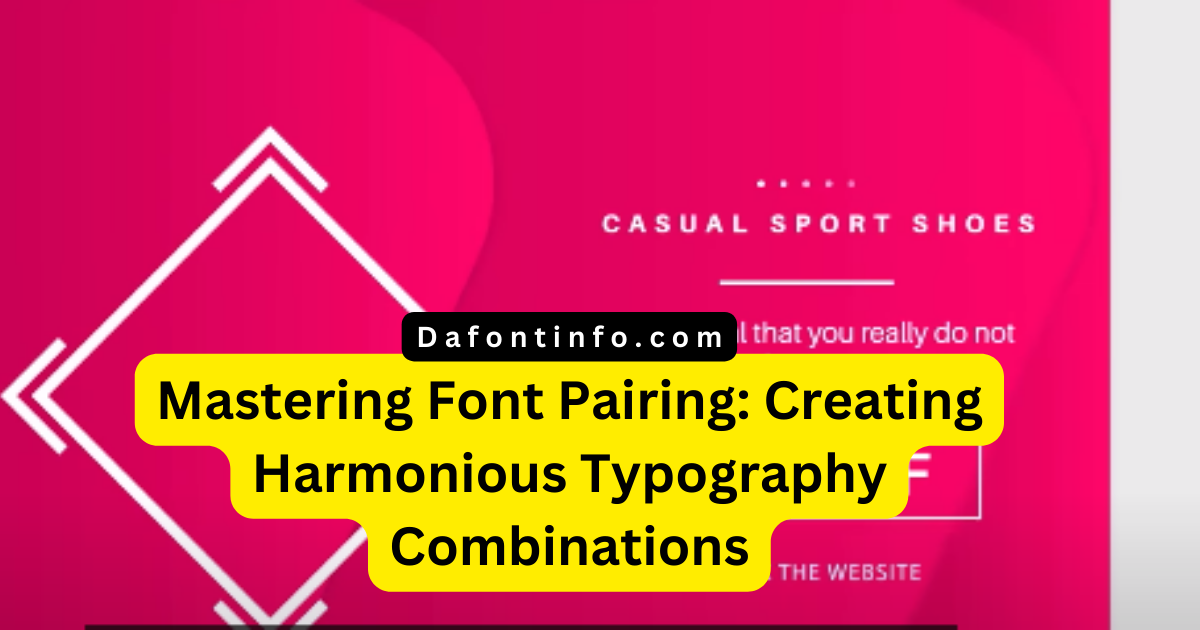
Unlocking the Art of Perfect Font Pairing for Outstanding Design

A crucial part of design is choosing font combinations that work well together and produce a pleasing visual effect. Whether it’s websites, logos, posters, flyers, or presentations, the right combination can substantially improve readability, attractiveness, and the overall impact of your design efforts. We’ll go into the subject of font matching in this article, giving you useful resources and examples of common font pairings.
Grasping Font Pairing

It’s like conducting a symphony of letters when you match together fonts. Font pairing uses several fonts to create an appealing and cogent visual outcome, much as how various instruments are used for harmony in a well-orchestrated musical performance. You must take into account elements like contrast, style, mood, and genre when choosing typefaces to pair.
Tools for Font Pairing Inspiration
Here are some internet resources that might help you create great combinations of fonts if you’re looking for ideas for font pairing:
Fontpair

This user-friendly website provides free, lovely fonts and already-chosen font pairs that have been crafted for your particular design requirements. It offers a number of font categories so you may see how fonts look in various settings, like headers and paragraphs. Additionally, you may obtain a PDF style book with over 100 pages of font inspiration and suggestions and alter the text to your specifications.
Fontjoy

With just one click, Fontjoy uses deep learning to produce font combinations. To find fonts with varying degrees of difference, you can create new pairings, lock fonts you prefer, and change the contrast. In addition, it provides the option to change the text as necessary and representations of how fonts seem in various sizes and weights.
Canva Learn

Canva Learn offers a thorough explanation of font pairing’s key concepts, including contrast, hierarchy, balance, and harmony. For various content kinds, including design magazines, blog entries, resumes, invitations, posters, and more, it offers 30 distinct font combinations. You may see these combinations in various layouts and colors and pick up helpful advice on how to match fonts effectively.
Popular Font Pairings
Here are a few well-known font combinations that make great beginning points for people looking for ideas:
This timeless combination of Playfair Display and Source Sans Pro features a serif and a sans-serif font with a sharp contrast in weight and style. Source Sans Pro is a straightforward and adaptable typeface that works well for body text and paragraphs, while Playfair Display oozes beauty and refinement, making it great for titles and headers.
Oswald and Roboto

This contemporary combo of a slab and a sans-serif typeface offers a strong and assertive image. While the streamlined and simple Roboto typeface is perfect for body text and captions, Oswald’s condensed and geometric style works well for headlines and banners.
Consider matching a display typeface like Monoton with the traditional sans-serif font Futura for a unique and eye-catching look. Futura lends a classic touch, perfect for subheadings and taglines, while Monoton gives logos and trademarks a metallic, chromatic vibe.
Belinda and Brandon Grotesque make a stylish combo since Belinda is a script font and Brandon Grotesque is a contemporary sans-serif typeface. Invitations and signatures look lovely in Belinda’s elegant and flowing letters, while headings and labels look great in Brandon Grotesque’s sleek and modern style.
Font Pairing for Resumes
It’s important to choose the appropriate font combination for your resume because it communicates professionalism and readability. The following are two suggested font combinations for a resume:
Lato and Roboto are a contemporary pairing of slab-serif and sans-serif fonts that have a robust and brash appearance. Roboto’s clear and uncluttered design is ideal for body text and captions, while Lato’s simplicity and adaptability make it suitable for headings and labels.
Playfair Display and Source Sans Pro: This time-honored pairing of serif and sans-serif fonts, with strong contrast in weight and style, is perfect for producing a formal and sophisticated CV. Playfair Display works well for titles and headings, and Source Sans Pro guarantees outstanding text legibility in paragraphs and body content.
Font blending is a skill that can greatly improve your design work. The visual appeal and impact of your work can be improved with the correct font selection. You can boldly explore the world of font pairing with the aid of the aforementioned tools and well-liked combinations, and produce strikingly beautiful and potent designs that make an impression.
FAQ
What is Font Pairing?
Font pairing is the technique of choosing and mixing various fonts to produce a unified and aesthetically pleasing design. The right matching improves design projects’ readability, attractiveness, and overall impact.
Why is Font Pairing Important?
Because it considerably affects a design’s effectiveness and aesthetics, font pairing is important. The readability is increased, a unified visual style is created, and the intended mood or message is conveyed using carefully chosen font combinations.
What Factors Should I Consider When Pairing Fonts?
Think about contrast, style, mood, and genre when combining fonts. These factors are essential in deciding whether fonts blend effectively and produce the intended design effect.
Are There Tools to Help with Font Pairing?
Yes, a variety of internet tools can help with creating font combinations and visualizing how they look in various settings. To name a few:
- Fontpair: This website offers type-specific, well-chosen font pairs as well as a lookbook with font suggestions and ideas.
- Deep learning is used by Fontjoy to produce font pairings with varying contrast levels.
- Canva Learn: Canva Learn offers a thorough explanation of font pairing in addition to 30 original font pairings for various content kinds.
Can You Recommend Popular Font Pairings?
Certainly! Here are some well-liked font combinations for various design requirements:
- A timeless combination of serif and sans-serif fonts with strong contrast in weight and style is Playfair Display and Source Sans Pro. Perfect for body text and titles.
- Oswald and Roboto are a contemporary combination of slab and sans-serif typefaces that have a robust and assertive appearance. Both headlines and body text are appropriate.
- A stylish combination of display and sans-serif typefaces with a retro and futuristic feel is Monoton and Futura. ideal for use as logos and subheadings.
- An attractive combination of a script typeface with a contemporary sans-serif font is Belinda and Brandon Grotesque. Perfect for headlines and invitations.
Can You Recommend Font Pairings for Resumes?
Yes, of course! These two font combinations are appropriate for resumes:
- Roboto and Lato: a contemporary combination of a sans-serif and a slab-serif typeface with a robust and bold appearance. Excellent for body text and headings.
- An exquisite résumé calls for the classic pairing of Playfair Display and Source Sans Pro. Use Source Sans Pro for body text and Playfair Display for titles.


