Font Pairing Techniques
The art and science of font matching entails the deft placement of various typefaces to create a typographic design that radiates harmony and aesthetic appeal. This is a very important habit because it can improve the text’s readability, make it more visually appealing, and affect the mood that the text expresses in general. Furthermore, a distinct visual identity or the successful communication of a particular message can also be greatly influenced by the choice of font combination.
Prior to diving into the world of font matching, there are several fundamental ideas and difficulties to consider. Finding fonts that have similar qualities—like style, mood, or historical era—while also making sure that there is adequate contrast—like in terms of weight, height, or shape—is essential to a successful combination. The reader’s eye is drawn in and their experience is guided by this interaction between resemblance and diversity, which also establishes a hierarchy and adds visual appeal to the text.
Furthermore, the art of font pairing is highly context-dependent, thus the design’s particular goal and media should be taken into account. The target demographic, genre, and intended tone are just a few of the variables that need to be considered because they have a big impact on the typeface selection process and the final outcome of the typographic design. To put it simply, font pairing is a multifaceted process that combines typographic expertise and artistic sensibilities to deliver messages and produce visually striking experiences.
Font categories and characteristics
- Serif fonts have small strokes or projections at the ends of the main strokes of the letters. They are often associated with classic, elegant, formal, or traditional styles. Some examples of serif fonts are Times New Roman, Georgia, and Garamond.
- Sans serif fonts lack these strokes and have clean and simple lines. They are often associated with modern, minimalist, casual, or futuristic styles. Some examples of sans serif fonts are Arial, Helvetica, and Verdana.
- Script fonts mimic handwriting or calligraphy with flowing and connected strokes. They are often associated with elegant, feminine, artistic, or romantic styles. Some examples of script fonts are Brush Script, Lucida Calligraphy, and Zapfino.
- Display fonts are designed to catch attention and stand out. They have distinctive and decorative features that make them suitable for headlines, logos, or posters. They can evoke various styles and moods depending on their shapes and details. Some examples of display fonts are Impact, Cooper Black, and Comic Sans.
- Handwritten fonts also mimic handwriting but with more casual and personal strokes. They are often associated with friendly, playful, creative, or informal styles. Some examples of handwritten fonts are Marker Felt, Kristen ITC, and Doodlebug.
Font pairing strategies and examples: Some general rules and tips for creating effective font pairs are:
- Use contrast to create interest and hierarchy. For example, you can pair a bold and heavy font with a light and thin font, a large and tall font with a small and short font, or a geometric and angular font with a rounded and organic font. Contrast helps to draw attention to the most important elements of your design and to create a clear distinction between different levels of information. For instance, in the first example from 99designs, Clarendon and League Gothic are paired to create a classic and elegant look. Clarendon is a serif font with thick strokes and prominent serifs, while League Gothic is a sans serif font with thin and condensed letters. The contrast between the two fonts makes the headline stand out and the body text easy to read.
- Use harmony to create balance and cohesion. For example, you can pair fonts that belong to the same family or style, such as different weights or variants of the same font, or fonts that share some common features or moods. Harmony helps to create a sense of unity and consistency in your design and to convey a specific tone or message. For instance, in the second example from 99designs, Quando and Judson are paired to create a feminine and charming look. Quando and Judson are both serifs with a good dose of character and curved shapes. The harmony between the two fonts makes the design feel friendly and inviting.
- Use context to create relevance and appropriateness. For example, you can pair fonts that match the medium, audience, genre, or tone of your design. For instance, you can use a serif font for a print publication or a formal document, a sans serif font for a web page or a digital product, a script font for an invitation or a greeting card, a display font for a logo or a poster, or a handwritten font for a personal note or a diary. Context helps to create a sense of suitability and credibility in your design and to communicate your purpose and intention. For instance, in the third example from Elementor, Allan and Lato are paired to create a modern and fresh look. Allan is a display font with a handwritten style that resembles hand-painted signs, while Lato is a sans serif font with a sleek and simple appearance. The context of the two fonts matches the web design medium and the lifestyle blog genre.
Some examples of successful font pairings for different purposes and styles are:
Playfair Display + Source Sans Pro
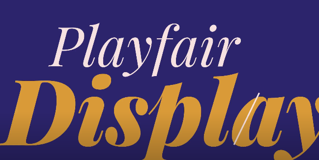
This typeface mix of serif and sans serif is traditional. Playfair Display is a classy typeface with a striking contrast between its thick and thin strokes. A humanist-inspired typeface with a clean, straightforward design is Source Sans Pro. Professional and attractive designs can benefit from the balanced and harmonious appearance that the contrast between the two typefaces creates.
Montserrat + Open Sans
This is a contemporary and understated pairing of two sans serif fonts. Montserrat is a geometric typeface with an elegant, modern appearance. Open Sans is a readable, neutral font with an open, approachable appearance. Because of their similarities, the two fonts have a unified, consistent style that works well in modern and minimalist projects.
Pacifico + Quicksand
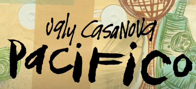
This is a creative and lovely blend of a sans serif and a script font. Pacifico is a handwritten font with a flowing, fluid design. The rounded font Quicksand feels delicate and kind to the touch. The contrast between the two typefaces produces a visually captivating and lively effect that works well in romantic and artistic themes.
Bangers + Crete Round
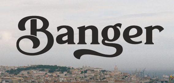
This display and serif typeface combination is old-fashioned and retro. Bangers is a strong, lively font with a comic book aesthetic. Slab serif font Crete Round has a rough, rustic vibe. The two fonts’ contrast produces a striking, nostalgic effect that works well with retro and vintage designs.
Amatic SC + Josefin Sans
This is a warm and whimsical pairing of two handwritten fonts. The font Amatic SC is wacky and whimsical, with a relaxed vibe. Josefin Sans is a geometric typeface with a refined, airy quality. The contrast between the two fonts produces a captivating and dynamic appearance that works well in designs that are lighthearted and amiable.
FAQ
What is font pairing, and why is it important?
Font pairing is both an art and science, involving the skillful combination of different fonts to create a visually pleasing and harmonious typography design. It’s crucial in design as it enhances the readability, aesthetics, and emotional impact of text. Effective font pairing can better convey a message, identity, or mood.
What are the key principles of good font combinations?
Choosing the right font pair involves balancing commonalities and contrasts. Fonts should share characteristics like style, mood, or era but also exhibit differences in weight, size, or shape to maintain interest and hierarchy. The choice also depends on the specific context, such as the medium, audience, genre, or tone of the design.
What are the primary font categories, and what characteristics define them?
Serif fonts: These feature small strokes or projections at the ends of letters and are often linked to classic, elegant, or traditional styles (e.g., Times New Roman).
Sans serif fonts: These lack such strokes, boasting clean and simple lines, and are associated with modern, minimalist, or casual styles (e.g., Arial).
Script fonts: These emulate handwriting or calligraphy, with flowing and connected strokes, often evoking elegance, femininity, or artistry (e.g., Brush Script).
Display fonts: Designed to catch attention and stand out, they’re ideal for headlines, logos, and posters, with various styles and moods (e.g., Impact).
Handwritten fonts: Mimic casual handwriting, conveying friendliness, playfulness, and informality (e.g., Marker Felt).
What are some strategies and examples for effective font pairing?
Use contrast for interest and hierarchy: Pair bold and light fonts, large and small fonts, or geometric and rounded fonts to create distinctions between elements. For example, Clarendon and League Gothic contrast beautifully for a classic and elegant look.
Use harmony for balance and cohesion: Pair fonts from the same family or style or those with common features to create unity. For instance, Quando and Judson blend harmoniously to create a feminine and charming appearance.
Use context for relevance: Match fonts to the design’s medium, audience, genre, or tone. Allan and Lato, for example, suit a modern web design context and lifestyle blog genre.
Can you provide some examples of successful font pairings for different styles and purposes?
Playfair Display + Source Sans Pro: Ideal for professional and elegant designs.
Montserrat + Open Sans: Perfect for modern and minimalist designs.
Pacifico + Quicksand: A dynamic choice for artistic and romantic designs.
Bangers + Crete Round: Well-suited for vintage and retro designs.
Amatic SC + Josefin Sans: A friendly combination for playful designs.


